Why Does Casino Glamour Keep Showing Up in Movies and Ads?
A casino can be introduced in a film with a single shot: a doorway opens, light spills across a polished floor, and a figure in evening clothes steps into a room full of movement. The setting is understood before anyone explains it. It suggests money, risk, performance and a break from ordinary life—all at once.
That efficiency is why casino glamour keeps returning in movies and advertising. It is not simply a matter of gold trim or sparkling chandeliers. Casino imagery is a recognizable visual vocabulary: a set of objects, layouts, gestures and contrasts that audiences already know how to read. Designers can use it to establish a mood quickly, while the details—how a room guides the eye, how clothing meets architecture, what a phone screen can show—determine whether the scene feels convincing or merely crowded.
A visual vocabulary audiences already know
Casino imagery carries a lot of meaning in a small amount of screen time. A roulette wheel, a bank of lights, a velvet rope or a sharply dressed character can act as an instant setting cue. Viewers do not need a tour of the building to understand that they have entered a place governed by spectacle, money and social codes.
This vocabulary is flexible. A film might use the casino as a glamorous destination, a stage for suspense or a room where a character is out of their depth. An advertisement might borrow the same visual signals to promise a change of pace. The setting can be elegant, hectic, playful or faintly intimidating depending on which cues are emphasized.
That familiarity is useful, but it also creates a risk. If every scene leans on the same shorthand—black tie, gold surfaces, dramatic shadows—it starts to feel like a costume version of a casino rather than a place with its own design logic. Casino glamour is not a dress code borrowed from movie posters. It is a way of organizing attention and creating an occasion.

Interiors that make an occasion
Casino interiors are built to hold activity and attention. Their visual effect comes from the relationship between surfaces, light, movement and use—not from expensive-looking materials alone. A reflective floor can extend a view and catch points of light; a patterned carpet can make a broad room feel more grounded; a high ceiling can lend scale to a busy floor. Each choice contributes to how the space is read.
Light, contrast and focal points
Lighting helps separate the room into zones. A bright feature may draw the eye toward a central installation, while softer pools of light make a lounge or bar feel distinct from the main floor. The contrast creates rhythm: the visitor sees a sequence of places rather than one uninterrupted field of activity.
Movie and advertising teams often heighten these contrasts for the camera. A chandelier can become a strong silhouette; a row of lamps can frame a character; reflective surfaces can carry movement through the background. On a real set, the lighting also has practical jobs: faces must remain readable, movement needs to be safe, and reflective materials must not create distracting glare. The most effective image is not necessarily the brightest one. It is the one that gives the viewer a clear place to look.
Materials that signal formality
Stone, brass, glass, velvet and polished wood appear often in casino-inspired imagery because they have distinct responsible gambling message template visual properties. Some reflect light; some absorb it; some suggest age or permanence. Pairing them gives a designer a way to create contrast without filling every surface with ornament.
There is a difference between using a material to shape an experience and using it as decoration that steals space from usability. A grand doorway can make an entrance memorable, but the route through it still needs to be clear. A sculptural feature can give a room a focal point, but it should not block circulation or make the useful parts of the space hard to find. Glamour works best when the design remains legible.
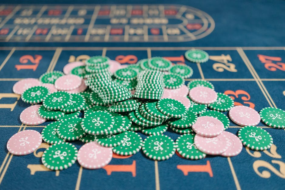
Visual hierarchy: how a room moves the eye and the visitor
Casino rooms are not just pictures. People move through them, pause, choose where to look and decide where to go next. Good visual hierarchy supports that movement. A strong focal point establishes orientation. Repeated lines or patterns suggest a direction. Changes in ceiling height, floor treatment or lighting can signal a transition between areas.
That same hierarchy helps a camera tell a story. A wide shot establishes the scale of the room; a medium shot connects a character to a table or bar; a close-up isolates a hand, a face or a reflective detail. The setting becomes more than a backdrop because its layout helps explain what matters in the scene.
On a live studio set, the design challenge is especially clear. The room has to feel coherent to a viewer watching a framed broadcast, even though the camera sees only selected angles. Live studio broadcasts rely on controlled sightlines, consistent lighting and carefully placed visual anchors. A table, a studio host and a background feature need to read clearly without competing for attention. The viewer should understand where the action is, rather than having to search the frame.
This is a useful lesson for physical interiors, too: a room can be elaborate and still be easy to navigate. The sequence of spaces matters. A grand entrance followed by a confusing layout is not a successful experience; it is only a strong first impression.
Fashion plus interiors: why the combination matters
Casino glamour is rarely just about architecture. Fashion plus interiors create a combined image of occasion. A tailored jacket against a dark wall, a vivid dress against pale stone, or relaxed clothing in a formal room can tell us something about a character before the dialogue begins. Clothing gives the scene a human scale; the interior gives the clothing context.
Costume and set teams often work in conversation, even when they are making different decisions. A fabric may disappear against a wall with a similar texture. A sequined outfit may become the brightest object in a scene, whether or not that was the intention. Color, pattern and sheen all affect how clearly a person stands out from their surroundings.
That relationship can also shape advertising. A carefully chosen outfit can make a setting feel current rather than like a recreation of a mid-century casino. Contemporary styling does not require abandoning familiar references. It can keep the visual cues people recognize while changing the proportions, colors and materials around them.
From famous rooms to screen shorthand
Real venues contribute to the visual language, but screen depictions are interpretations, not blueprints. The Casino de Monte-Carlo, for example, is widely associated with a formal, historically resonant image of casino life. Its architecture and public reputation provide a reference point for how popular culture frames elegance and occasion. A film or campaign may draw on that kind of association without reproducing the venue’s actual layout or atmosphere.
Coverage by CNA Luxury (Channel NewsAsia) offers another kind of reference: a way to see how luxury spaces and experiences are presented to a contemporary audience. Editorial coverage, venue photography and promotional imagery all help circulate ideas about what a casino should look and feel like. Those images can be influential even for people who have never visited the places shown.
The distinction matters. A real interior has to serve visitors over time, while a film set may need to work for one camera angle and one story beat. Advertising sits somewhere between the two: it borrows the credibility of a place but selects details to communicate a message quickly. The same chandelier, doorway or table can therefore mean different things in different contexts.
What changes on a mobile screen?
Casino glamour has to adapt when the setting is viewed on a phone. A mobile screen is a small, busy frame; details that work in a wide establishing shot can collapse into visual noise. Designers have to choose what survives at reduced scale: a recognizable silhouette, a clear focal point, a few distinct colors or a movement that reads immediately.
This is where selective detail matters. A phone interface does not need to reproduce an entire lavish interior to suggest an atmosphere. One strong architectural motif or a restrained palette can do more than a miniature collage of chandeliers, gold trim and patterned floors. The goal is not to cram the room onto the screen. It is to preserve the cues that make the image understandable.
Access also shapes the experience. Phone browser access, with no required app download, can make a service easier to reach for people who prefer not to install another application. For a digital operator such as MrQ, the browser is part of the presentation: pages need to load and remain readable on a small screen, with information organized so users can find the essentials without fighting decorative effects. Availability and features can vary by market and device.
That practical layer is easy to overlook when the conversation is about glamour. Yet a beautifully art-directed mobile page can still frustrate people if its text is tiny, its controls are crowded or the route between sections is unclear. Visual atmosphere and usability are not opposing goals; the challenge is deciding which details earn their space.
Motion without clutter
Animation and video can bring a digital presentation closer to the energy of a room. Live studio broadcasts, for instance, create a sense of people sharing a moment in real time. But motion is most useful when it clarifies what is happening. If several elements flash, move and compete at once, the effect is less like a lively room and more like a set that has forgotten to leave space for the viewer.
On mobile, a good hierarchy is especially important: the main action should be easy to identify, supporting information should be readable, and decorative effects should stay in supporting roles. This is the digital equivalent of a well-planned interior route.
Why the motif keeps returning
Casino glamour persists because it offers a compact story about entering a different world. It gives filmmakers and advertisers a ready-made vocabulary of anticipation, status and performance. More importantly, that vocabulary can be adjusted. A room can feel classic or contemporary, inviting or tense, depending on its light, materials, layout and relationship to the people inside it.
The strongest examples do not rely on ornament alone. They use visual hierarchy to guide the eye, movement to give the setting purpose, and fashion plus interiors to make the scene feel inhabited. They also know when to leave details out—especially in a mobile presentation, where a few recognizable references are more useful than a tiny, overloaded replica of a grand room.
That is the enduring appeal: casino glamour is instantly legible, but it is not a single look. It is a design language. Used with care, it can turn a doorway into an entrance, a room into a stage and a quick glance into an instant setting cue.